If coffee were a love language, it would most certainly be mine.
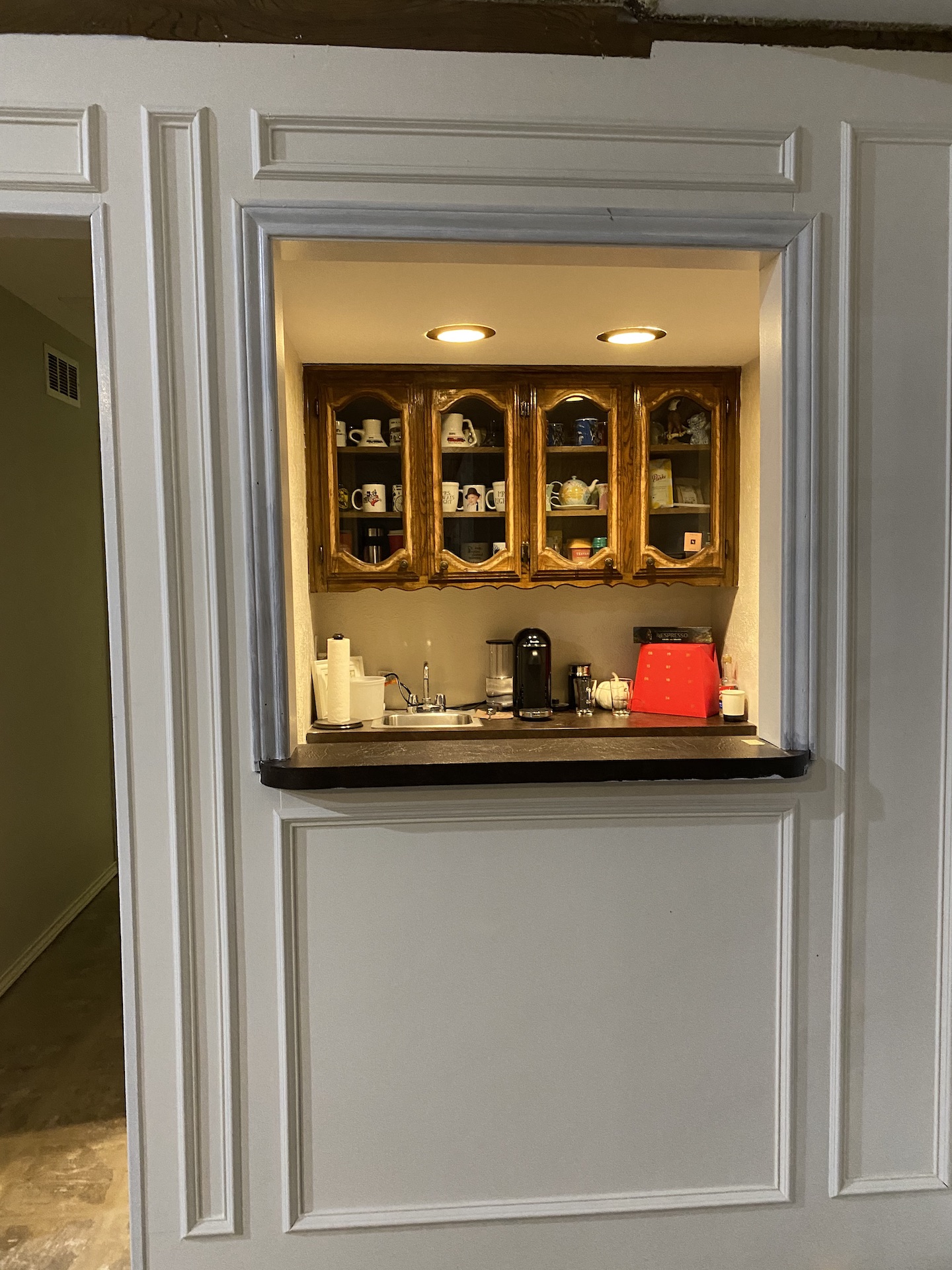
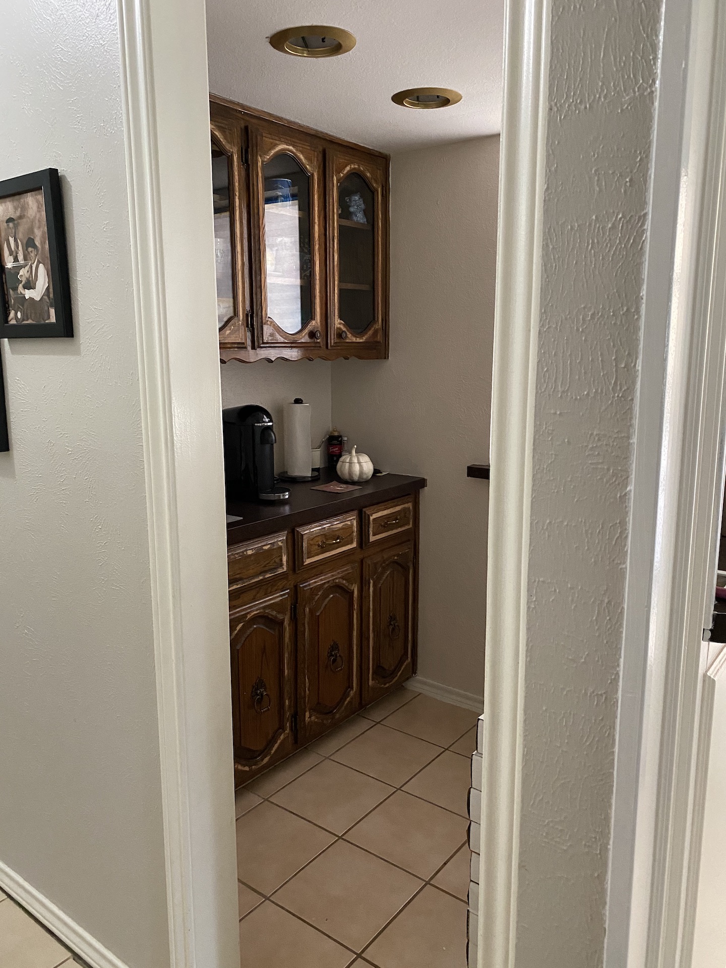
This space was originally the wet bar just off the family room. We when moved in we removed the saloon doors from the hallway and the shutters that closed the space off to the family room. Everything was dark wood and screamed 1970s. I loved the character and knew it would be something amazing at some point. Over the years we had thought about changing the countertops out and I am certainly glad that we waited. The wait was worth it!
The first step to this renovation to was ripping down the half wall/serving window to the family room. We decided to close off the entryway from the hallway, it just felt weird. When we started ripping out sheetrock we noticed there was about a foot above the original ceiling not being used. So, you guessed- we gutted the entire space. Out went the upper and lower cabinets, the sheetrock. A fresh slate. We spent some time redesigning this after we ripped everything out. I wanted it to feel open, inviting, and enjoy the view from the family room.
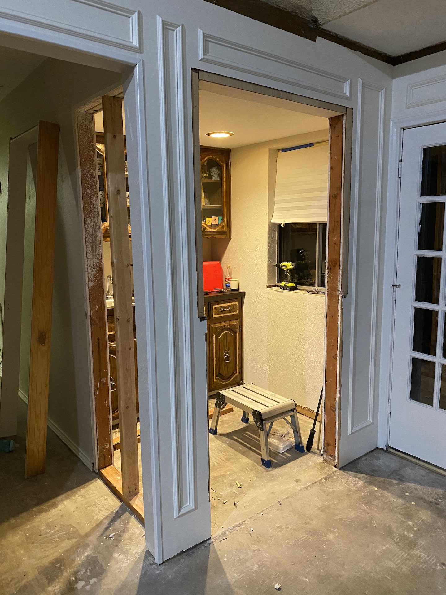
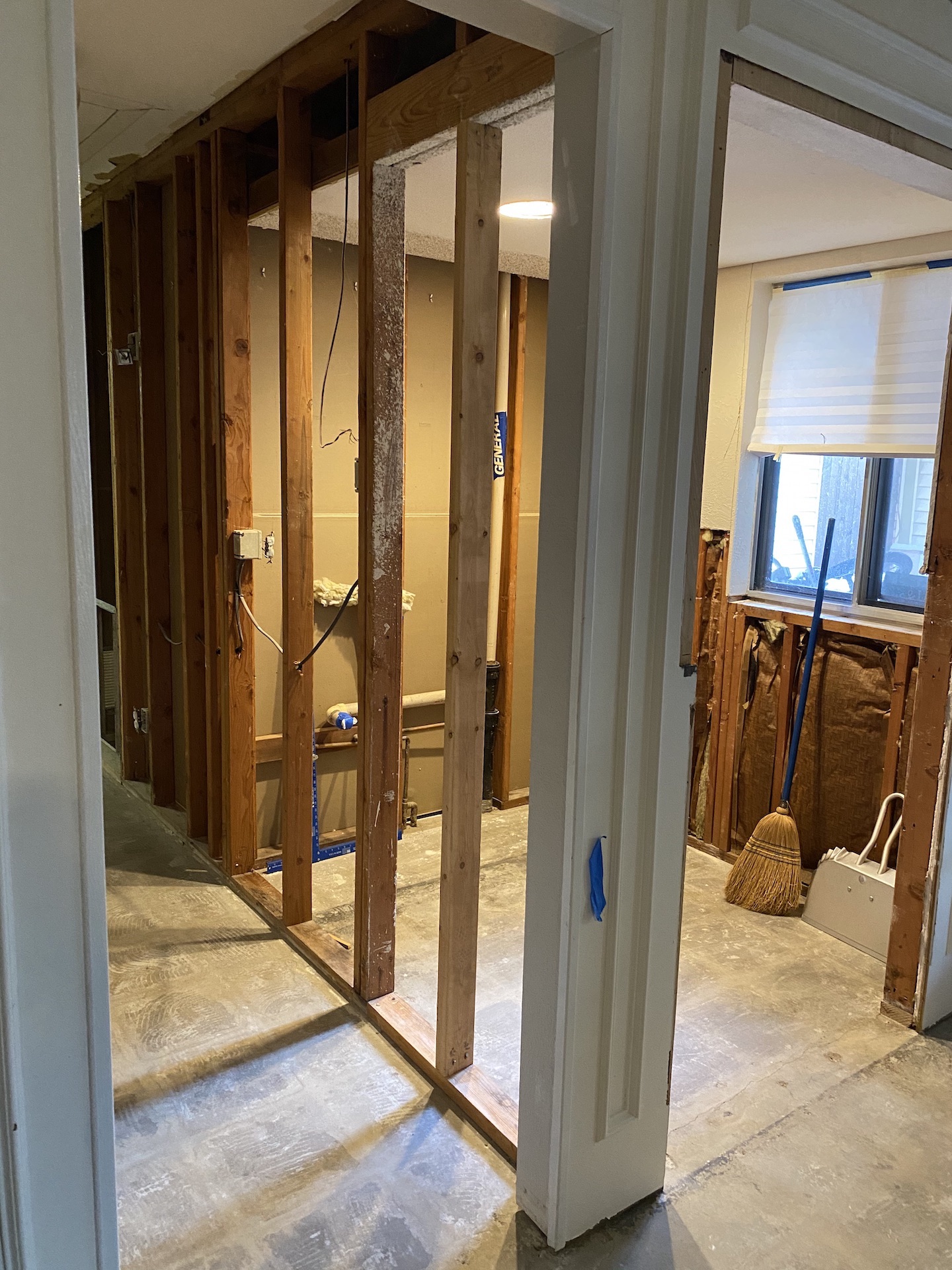
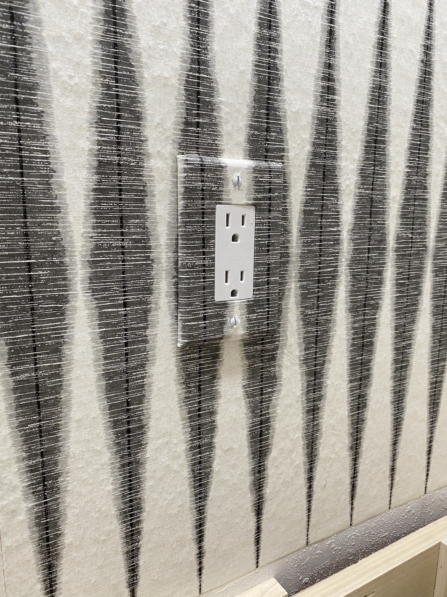
Important Tip: When you discuss electrical situations late at night, after many exhausting hours of work. Right them on your plans. We forgot to make the wall socket double and we did not move the light switch closer to the entry. Not a HUGE deal, but a definite bummer.
David and I make a great team. While he was working on the new lower cabinet and electrical, I started the sheetrock portion of the project. Mud, Tape, Mud, Sand, Texture. Such a messy job, but worth the amazing results.
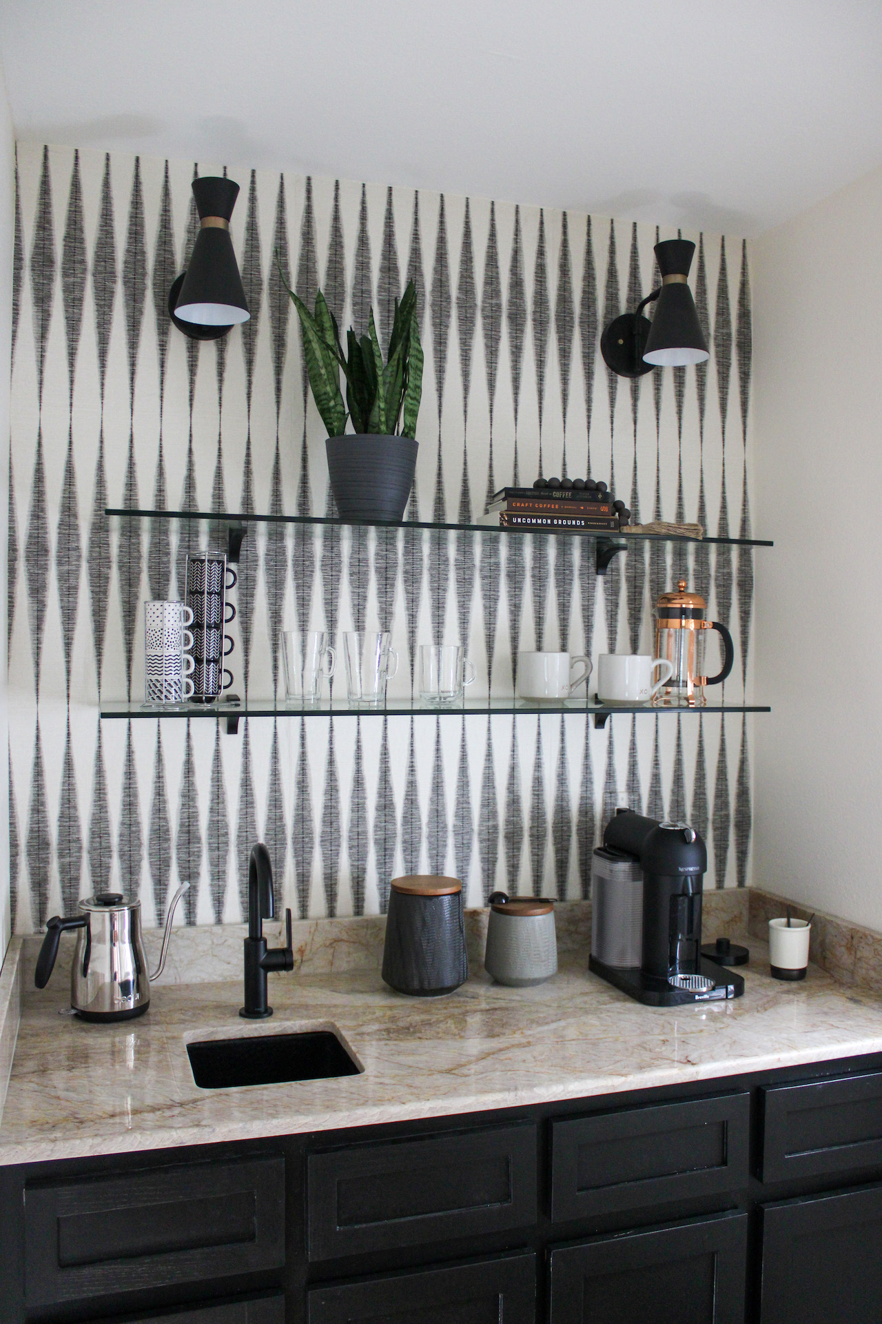
When we started to go back together the massive winter storm put some major slow downs on this project being completed, but we just went with the flow. The carried the wall color from the family room into this space, Behr White Veil- such a fabulous creamy white (at least in this house). We installed the cabinet and painted it Sherwin Williams Tricorn Black for depth to the space. After installation we decided to add a few pull out drawers for easier access to the coffee mugs and extra coffee. I am so glad that we did this!
Up next, WALLPAPER! I know there are mixed feelings about wallpaper, but I am here for it!!! I picked Handloom Black Geometric Pre-Pasted Paper by Magnolia Home, on Home Depot’s website. It feels like sounds waves and ties the other elements together. It was a breeze to hang and to cover the light switch. It takes a bit of patience to find the pattern at just the right spot to match, but if you ever wallpaper a room- don’t skip this step! It gives such a professional look to the job!
Lighting was up next! I ordered these pendant lights at the same time I ordered the wallpaper. They matte black with just the slightest touch of brass was perfect! A huge plus was the pivoting factor, so if they needed to be adjusted once everything else was installed, we had the option!
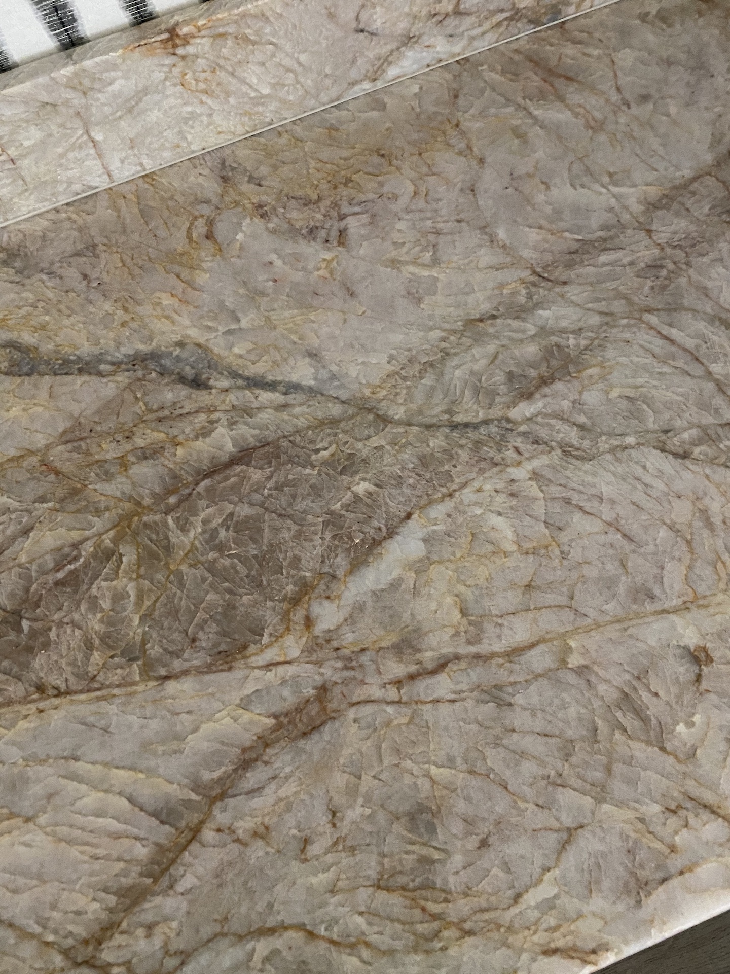
David has a friend in the stone industry and he happened to save us a remnant piece of the renoir quartzite from his personal kitchen remodel. The veining and movement on this slab is the icing on the cake. Adds a pop of color, and brings in some natural elements. When it was finally install day, the team installed the black hammered sink that I found on Wayfair. We wanted something smaller for this space as it would mainly be used for refilling the Nespresso Machine. It was finally time for the final touches! I ordered glass floating shelves from Fab Glass and Mirror. Selection, pricing, and shipping were great. Highly recommend.
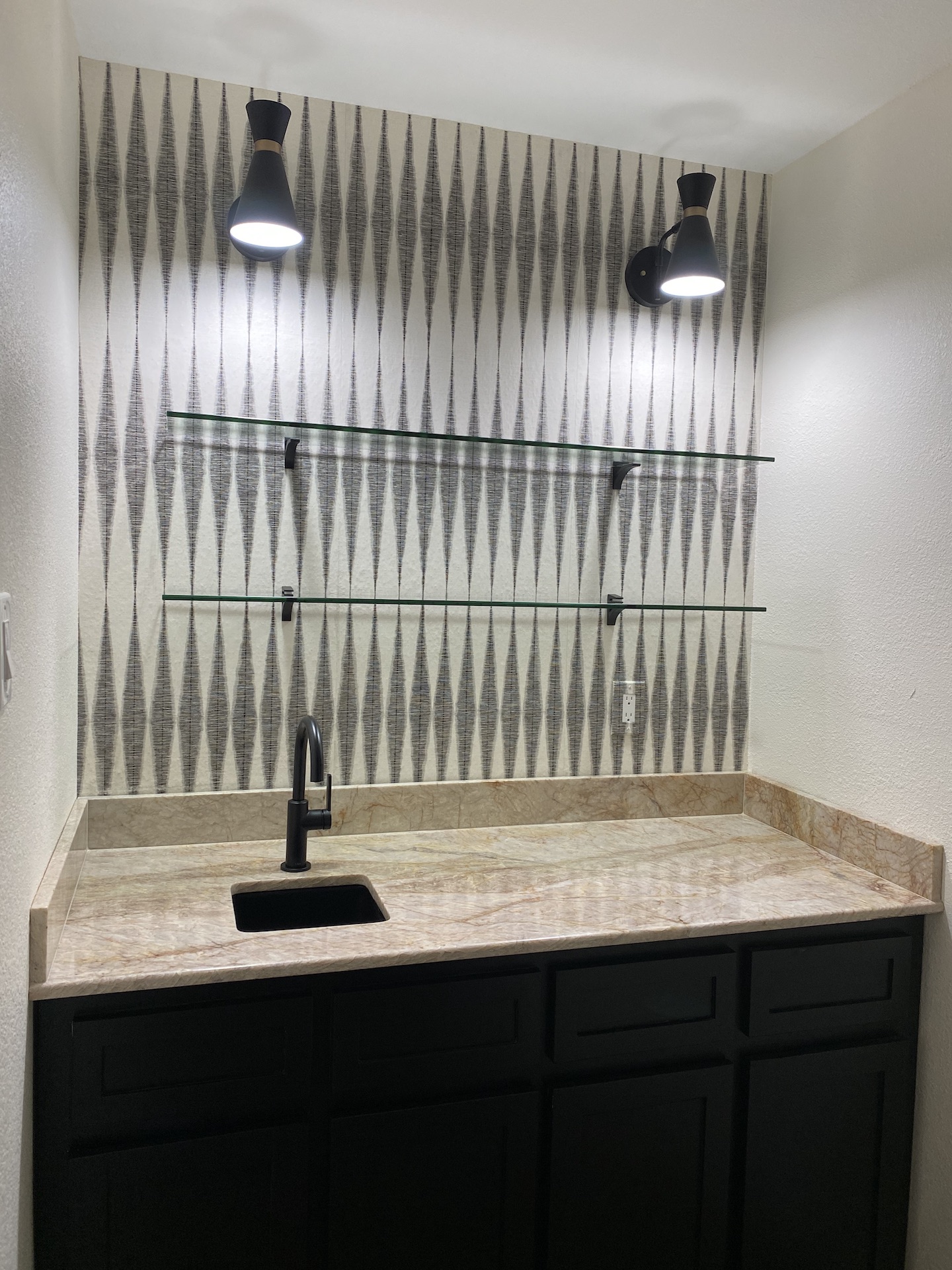
We picked this Kraus Matte Black Faucet from Home Depot and added a filtration system in the cabinet. (Again, mostly to refill the Nespresso Machine and Kettle.
We love everything about this space. We hope you do, too! Thank you for following along!
